

As a graphic designer, understanding colour theory is crucial for creating visually stunning and impactful designs. In this blog post, I will guide you through practical examples and tips that you can apply to your design projects. Let's dive into the world of colour and unlock your creative potential!
The Basics of Colour:
To start, let's review the basics of colour theory. Imagine you're designing a poster for a music festival. Instead of randomly selecting colours, consider the emotions you want to convey. Bright, vibrant hues like energetic reds and yellows can evoke excitement, while cool blues and purples may create a sense of calm. By understanding the emotions associated with colours, you can make intentional choices that align with your design's purpose.
Exploring Colour Harmonies:
Colour harmonies are combinations of colours that work well together. For example, let's say you're designing a website for a luxury hotel. You can create an elegant and sophisticated look by using an analogous colour scheme with shades of deep blues, teals, and greens. Experiment with different harmonies, such as complementary or triadic, to find the right balance and enhance the visual appeal of your designs.
Using Contrast for Impact:
Contrast is a powerful technique that adds interest and guides the viewer's attention. When designing a logo, consider the concept of contrast. If your logo consists of a bold, dark-coloured icon, balance it with a light-coloured background to create a strong visual contrast. This contrast will make your logo stand out and leave a lasting impression.
Applying Colour Psychology:
Colour psychology plays a significant role in branding and marketing. Let's say you're designing a packaging label for a natural skincare product. Incorporate soft, earthy tones like greens and browns to convey a sense of nature and authenticity. By understanding the psychological associations of colours, you can effectively communicate the desired message and connect with your target audience.
Incorporating Colour in Typography:
Colour can also be applied to typography to enhance the overall design. When designing a magazine layout, experiment with using different colours for headings, subheadings, and body text. For example, choose a vibrant colour for the headlines to grab attention, while keeping the body text in a legible and contrasting colour. This application of colour in typography adds visual interest and improves the readability of your design.
Conclusion:
Colour theory is a powerful tool that can elevate your graphic designs to new heights. By incorporating these practical tips and examples into your design process, you can create visually appealing and impactful designs. Remember to experiment, trust your instincts, and always consider the emotions and messages you want to convey through your colour choices.
Embrace the power of colour and let your designs come to life. Happy designing!
Looking to expand your design knowledge even further?
Don't miss out on my Design Fundamentals Course! This beginner friendly course is packed with key design principles, fundamentals, and practical examples to help you elevate your designs and take your design career to the next level!
Learn the rules of great design, and when you can break them! Click the button below to learn more!

Hi, I'm Mars
Graphic Designer
I am passionate about empowering aspiring designers, and dedicated to sharing knowledge and resources, providing tools and challenges that fuel the growth of fellow and aspiring designers!
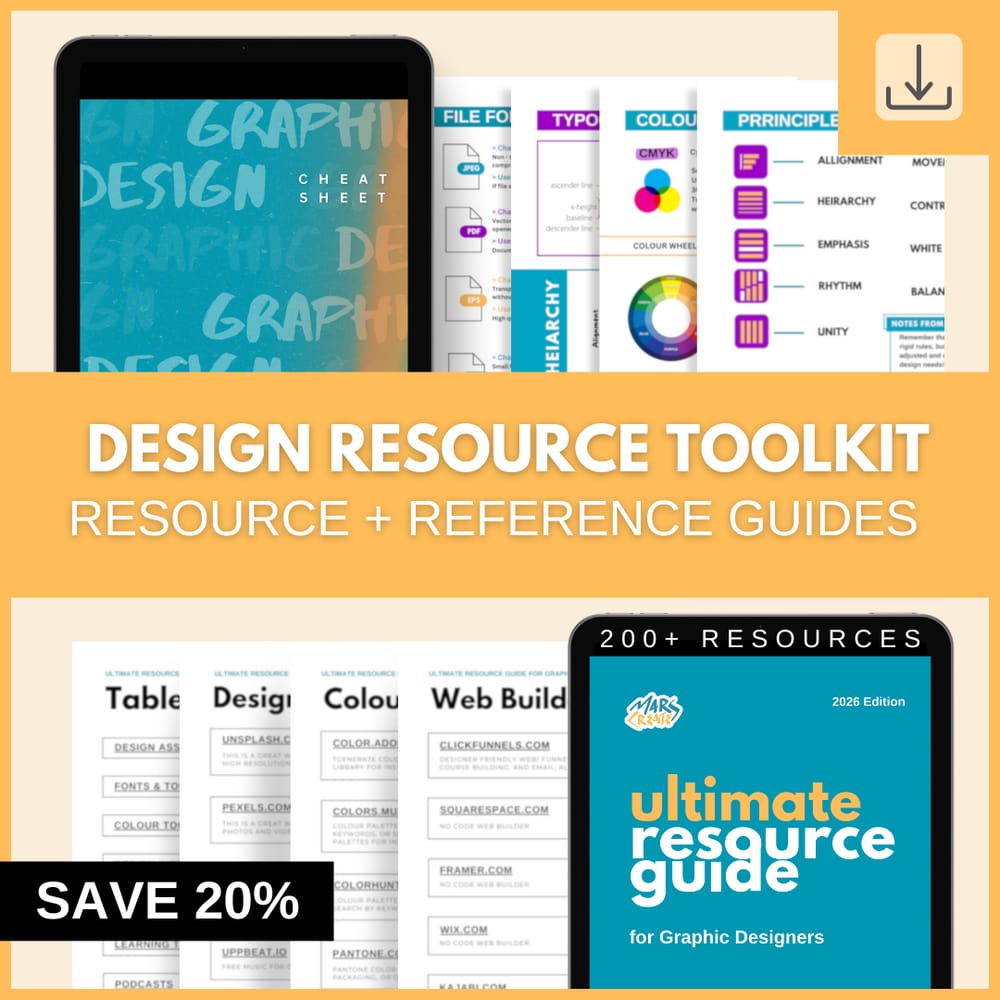
Streamline your design process!
Gain access to 200+ carefully curated design resources and the ultimate reference guide to topics that matter most!
See other posts like this one:
Tuesday, September 05, 2023
Unveiling Design: Top 5 Questions - Answered- from Aspiring Graphic Designers
Saturday, July 22, 2023
The Art of Typography: Unleashing the Power of Fonts, Alignment, Kerning, and More!
© 2023 MARSCREATES - All rights reserved - Privacy Policy