

Hey there, fellow designers! Today, we're diving deep into the world of typography - the magic that turns words into visually stunning masterpieces. Whether you're crafting a website, flyer, or social media graphic, typography can make or break your design. So, buckle up and let's explore seven essential tips to rock your typographic game!
Get to Know Your Font Families - It's Like Making New Friends!
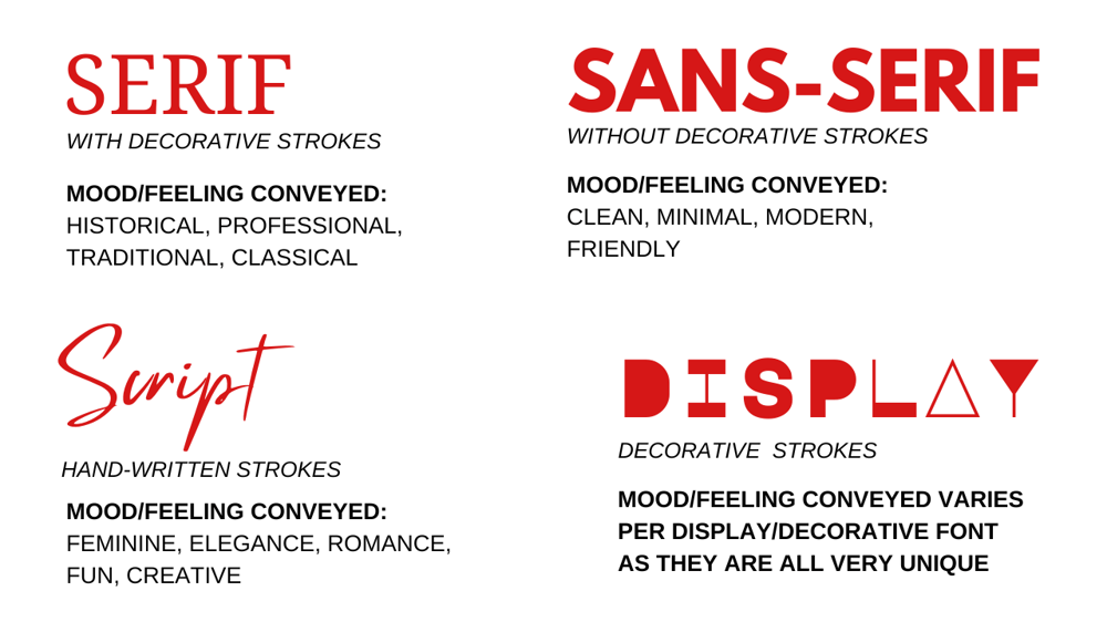
Think of font families as your design BFFs. They come in different shapes and styles, each with its unique personality. You've got the classy Serif fonts, perfect for formal vibes, like a fancy dinner party invitation. Then there's the cool Sans-Serif gang, bringing that modern and clean look to your website or flyer. Oh, and let's not forget the script fonts, like those elegant handwritten notes you pass in class (oops, I meant office meetings!). Finally, meet the flashy Display fonts, the life of the typographic party! Just remember, don't invite too many fonts to the party; stick to three or fewer to keep things harmonious.
Imagine you're designing a travel blog. You'd rock a fun Sans-Serif font for the headlines, a clean Serif font for the body text, and a playful Display font for the blog post titles. Voila! Typographic paradise!
Choose the Right Typeface - Match the Mood!
Picking the perfect typeface is like finding the ideal partner for your design. Whether it's a playful display font for a children's book cover or a sophisticated serif font for an elegant wedding invitation, the right typeface sets the tone and mood of your design. Keep your audience and the design's purpose in mind to make the perfect match.
You're designing a tech conference website. A sleek and modern sans-serif font would suit the high-tech vibe, while a casual handwritten font might not convey the professionalism you're aiming for.
Keep It Simple - Less is More!
Hey, we all love fonts - it's like being a kid in a candy store. But, before you go crazy with every font you find, remember the golden rule: less is more. Imagine if you were trying to read a book where every page had a different font - total chaos, right? So, be kind to your readers' eyes and stick to a maximum of three fonts per design. Trust us; your designs will thank you!
Picture this - you're designing a hip coffee shop menu. You'd choose a warm Serif font for the menu items, a chic Sans-Serif font for the descriptions, and maybe a cool Script font for the daily specials. Boom! A typographic masterpiece that your customers will love to read!
Alignment - Be a Word Whisperer!
Alignment is like the secret sauce that holds your words together. Left alignment is your trusty go-to, creating a neat and tidy look. Center alignment is the cool kid at the party, adding a touch of elegance and grabbing attention. But beware, center alignment can be a bit of a diva, so use it sparingly. And hey, don't forget right alignment; it can add a fun twist to your designs!
Let's say you're designing a heartfelt greeting card. Left align the sweet message inside, center align the recipient's name on the front, and right align the sender's name for a surprise element!
Maintain Hierarchy and Readability - Guide Your Reader's Journey!
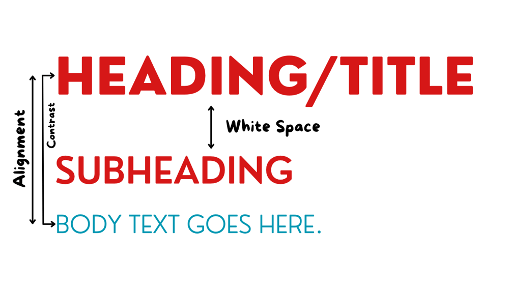
Hierarchy is your design's tour guide, showing your readers where to look and what to read first. Headlines, subheadings, and body text should be arranged in order of importance, helping your audience navigate through your design effortlessly. And speaking of readability, always ensure your text is clear and legible, using appropriate font sizes and line spacing.
When designing a magazine layout, give your headlines a larger font size to grab attention. Follow it up with subheadings and body text in descending order of font size, guiding your readers through the article smoothly.
Utilize White Space Wisely - Let Your Design Breathe!
White space, also known as negative space, is the breathing room of your design. It allows your design elements to shine and prevents overcrowding. Embrace the power of white space, and your designs will appear clean, organized, and visually appealing.
You're designing a minimalist poster for an art exhibition. Let your main artwork take center stage, surrounded by ample white space that accentuates its beauty.
Kerning - The Love Language of Letters!
Imagine your letters are in a relationship; kerning is the way they cozy up to each other. When they're not getting along, they create awkward gaps or crowded spaces. But when you master kerning, letters hold hands and create a harmonious dance that makes your typography swoon-worthy!
Say you're designing a catchy logo. The "V" and "E" in "LOVE" should be closer to each other, while the "O" and "V" need some space to breathe. It's like making sure your letters are the perfect match!
In conclusion, typography is the heart and soul of design. By getting friendly with font families, keeping it simple with fewer fonts, aligning like a word whisperer, mastering the art of kerning, choosing the right typeface, maintaining hierarchy and readability, and utilizing white space wisely, you'll craft designs that make an unforgettable impression. So, go ahead and conquer the typographic world - you've got this!
Looking to expand your design knowledge even further? Don't miss out on my Design Fundamentals Course! It's packed with key design principles, fundamentals, and practical examples to help you elevate your designs and take your career to the next level! Learn more below. 🚀

Hi, I'm Mars
Graphic Designer
I am passionate about empowering aspiring designers, and dedicated to sharing knowledge and resources, providing tools and challenges that fuel the growth of fellow and aspiring designers!
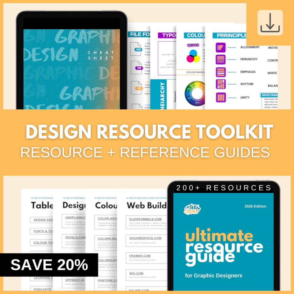
Streamline your design process!
Gain access to 200+ carefully curated design resources and the ultimate reference guide to topics that matter most!
See other posts like this one:
Tuesday, September 05, 2023
Unveiling Design: Top 5 Questions - Answered- from Aspiring Graphic Designers
© 2023 MARSCREATES - All rights reserved - Privacy Policy